I have some t-shirt ideas and thought I’d see what you all thought about them. I’m trying to create a different kind of willys t-shirt. The “Africa” shirt would be one of a series of “WWII” vehicles.


emailNeed to contact me and don't have my email? Click on email button.
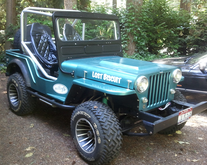
Welcome to eWillys.com, a website for vintage jeep enthusiasts. I update this website nearly every day with jeep deals, jeep history, interesting reader projects, jeep related info, and more.
These quick searches can help you find things on eBay. People list in the wrong categories all the time, so don't be surprised to see brochures in the parts area for example.
The links to posts below show jeeps grouped by models, condition, and other ways. Some of these jeeps are for sale and others have been sold. If you are unsure whether a vehicle is still for sale or not, email me at d [at] ewillys.com for more info.
There are plenty of interesting, unusual, historic and surprising stories related to Jeeps and their owners. In addition, some of these features have nothing to do with jeeps. This link will display all featured stories starting from the latest.
Looking for parts and not sure where to go? There are a variety of large and small new and used parts sellers both online and offline.
Importantly, the allure of buying a project jeep can be romantic. The reality of restoring a jeep can be quite different, expensive and overwhelming without the right tools and resources. So, tread carefully when purchasing a "project". If you have any concerns about buying a vintage jeep, or run across a scam, feel free to contact me for help, comments or concerns .
I have some t-shirt ideas and thought I’d see what you all thought about them. I’m trying to create a different kind of willys t-shirt. The “Africa” shirt would be one of a series of “WWII” vehicles.
I like these alot!
They look as though they have nice detailed, images.
Any prices, colors, etc., yet?
Please keep us informed of your progress.
Best,
Kilroy
Over and out…. 😉
Hi Dave,
Nice. These look good.
White shirt:
1) This one looks the least interesting to me. Partly because every element is on its own little space — it feels flat. On the yellow shirt, the overlapping creates depth and interest, and it ties everything together. 2) The image feels like it’s being squashed. I’d probably move “1940 Camp Holabird” below the Jeep. 3) “BRC – THE ORIGINAL” is a bit hard to read because the letterspacing it too loose. 4) I also think this should be set bigger than “1940 Camp Holabird.” I’m thinking heirarchy here. Think Big, Medium, Small. I see the Jeep image (Big), then tell me what I’m looking at, which is a BRC (Medium), then the misc info “1940 Camp …” (Small). The Jeep needs a shadow underneath.
Yellow shirt:
1) Again, same “BIG MEDIUM SMALL” rule applies here. I think “BRITISH 8TH ARMY — TRIPOLI” should be the MEDIUM element, so it should be set bigger than the date. 2) The Jeep has a drop shadow, which is incorrect. The shadow needs to be underneath the Jeep, on “the ground.” 3) Letterspacing on the date is too loose. 4) A correct em dash, not two dashes, should be used between “ARMY” and “TRIPOLI.” I use two dashes online, but on printed stuff, I’d use an em dash. 5) The Jeep feels a bit small next to the silhouette of Africa. I’d make it 20%+ bigger. You’d cover up more of the silhouette, but it would still be recognizable.
I’d buy these. When are they for sale?
Dexter
Thanks for the feedback! Those are prefect comments.
– D
I like the antique look of the shirts. The first shirt could get lost to non-Jeep people because they don’t know what a BRC is.
I love the second one really cool. Knowing what I do of the British I would look at coloring the Flag maybe in a dot metrics to give it age.
There is a lot of ways formats
The farm Jeep with attachments..
The Western trail rig….
Texas hunting jeep….
The mud bogger ….
The dune jeep….
Brian .. yeah, you see where I’m going with it. That’s a good idea on the flag. I can fade the edges, which will help create that feel. I’ll do that for the 2nd round of design in the next couple of days.