UPDATE IV: Branden found this 1945 Parts List booklet that includes a prominent “J” logo. This is the most prominent use of the logo that I’ve seen. It’s not clear to me whether this booklet was introduced with the jeep in August of ’45 or a little later in ’45.
![]()
==============================
UPDATE III (04/07/2019): Maury spotted the a “J” dealership sign example on this Miller Tools brochure:

UPDATE II: I’ve added two examples of ‘dark’ “J”s, dark (blue or black) background with white letters. Now that I think about it, I guess this is similar to the black and white newspaper versions.
CREDIT: Douglass, Neal. Harry Payne Motors, photograph, June 3, 1942; (https://texashistory.unt.edu/ark:/67531/metapth34338/m1/1/: accessed April 7, 2019), University of North Texas Libraries, The Portal to Texas History, https://texashistory.unt.edu; crediting Austin History Center, Austin Public Library. … MY NOTES: The photo year is more likely late 1947 or 1948.
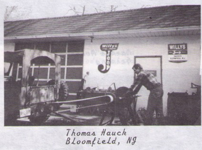
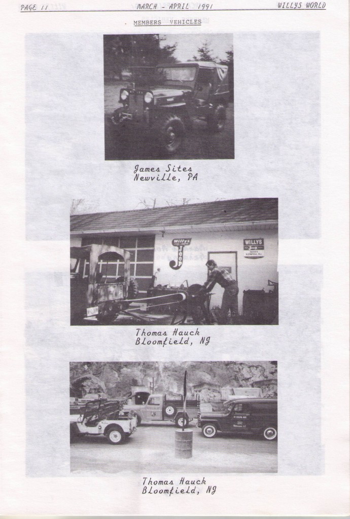
From Willys World March-April 1991 issue.
UPDATE: This is best described as a working draft that Maury Hurt and I have constructed in the hopes of understanding Willys-Overland’s “J” logo better …. If you have input, please email me or add it in a comment at the bottom of the post.
In January of this year, Maury emailed me about a Willys/Cars•Trucks/Jeep logo that he was hoping to reproduce, wondering if I had any better examples of it. That simple email turned into a mission: Find out the history behind the logo.
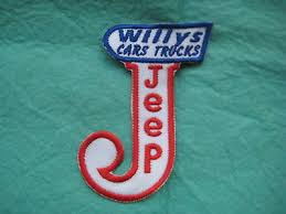
I have one of these patches. Not sure who created them or when.
It turned out that we could find no articles or discussion about the evolution of the logo. So, we spent a month looking through old brochures and advertisements to develop a theory of what it should look like, when it was used, and why.
What’s the logo supposed to look like?
Our first challenge was to determine what the logo was supposed to look like. As these examples show, different fonts and slightly different looks were used in the printing of the logo.
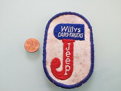
Another patch example.
This was from a January 1946 magazine ad.
![]()
or even this one …
Our suspicion is that this is from overseas, possibly Australia? We don’t have a time frame on this one.
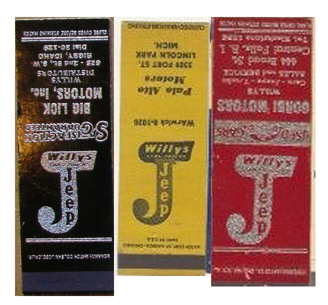
And, the list would not be complete without some matchbook covers:
How should the “J” look?
Other questions we had included how wide and tall should the long part of the “J” be; how should the interior font look; and how tall and large should the curly portion of the “J” be? Again, revisiting the examples above, the fonts, sizes and shapes differ.
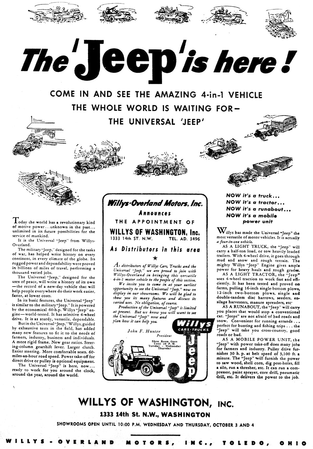
Our Best Example choice:
Eventually, we decided that ads produced specifically by Willys-Overland with dates we could document should be given the most weight. Because of that, we settled on this ad being the foremost example of the logo.
![]()
And here is the reproduced version made by Maury:
![]()
Logo Details:
On closer inspection of the best quality versions of the logo, we learned the “J” logo had a variety of nuances. First, the top blue portion has a right side that scallops like a bird wing. This design may have been influenced by the Willys logo shown below, but we have not date on that graphic.
![]()
The “J” logo’s blue section drops down farther on the red “J” on the left hand side vs. the right hand side.
The “J” reflects the cj2a-launch-time font not seen prior to the launch of the CJ-2A in July. The font down the center of the “J” is equally new.
The closest example we found to the font designs found on the “J” logo came not from Willys-Overland, but from this WWII Jeep-Soap product that wasn’t made by Willys-Overland.
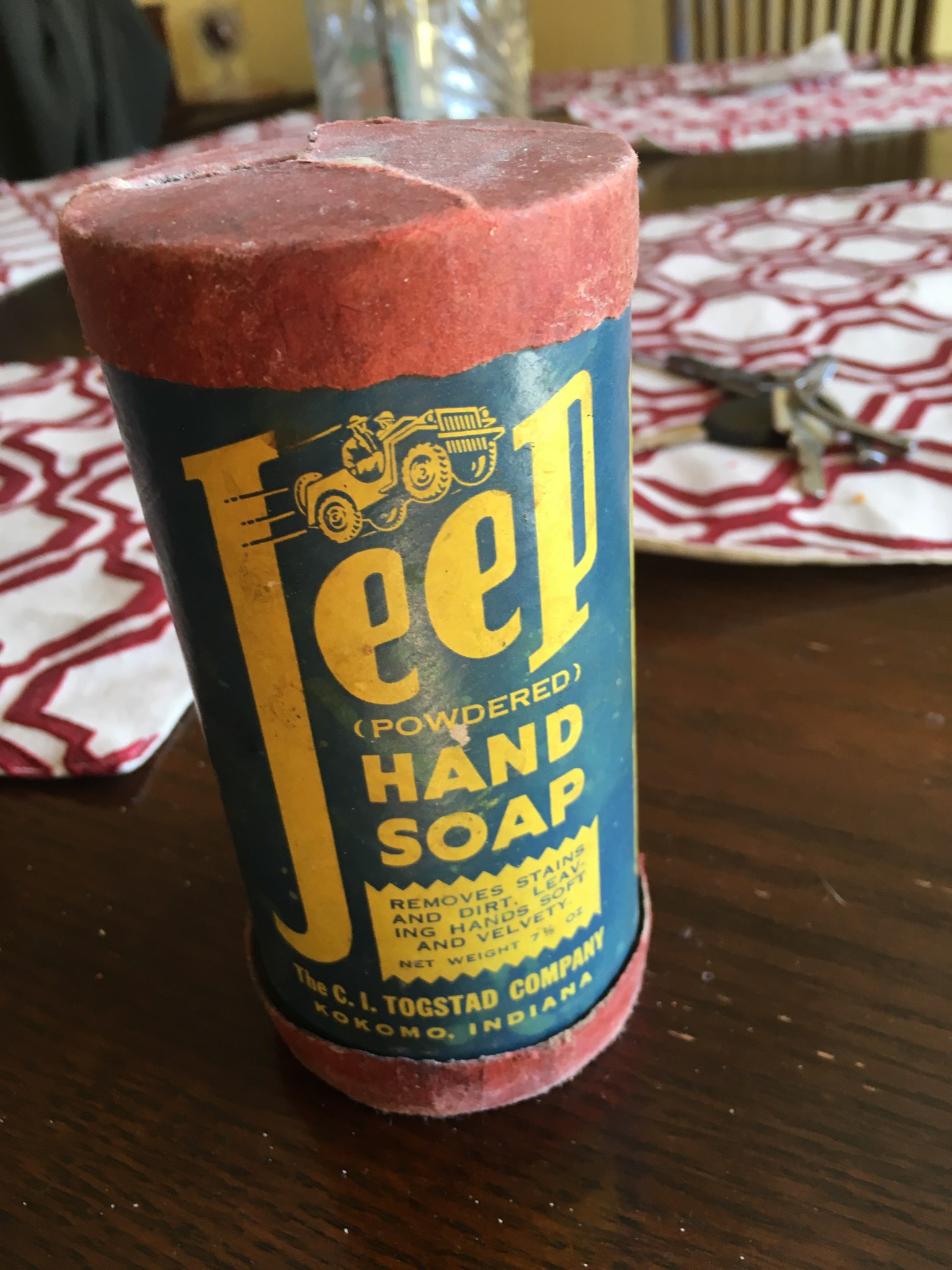
Coincidence that this design preceded the “J” designs by Willys-Overland? Probably.
When was the “J” logo first used?
As a part of the search for the ‘best-case’ logo, we discovered that Willys only used the logo a short time. The “when” turned out to be pretty easy to figure out. A search of our joint documents concluded that the earliest use we could date was October 03, 1945, but that was in black and white:
Evening Star, October 03, 1945, Washington, D.C.
On November 10, 1945, the “J” logo appeared in color for the first known time when Willys published a two-page ad in the Saturday Evening Post: “Willys … Presents to the World” “The Universal ‘Jeep’ …”.
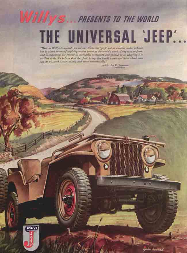
Saturday Evening Post November 10th Ad (one of two pages).
Willys did not publish an ad with the “J” logo in Collier’s Magazine until December 1945. Then, following that issue, none of the other ads in Colliers ever included the “J” logo again.
Collier’s December 1945 ad.
Though the earliest documented date for the logo is October 03, 1945, we believe the earliest undated example of the logo’s use was in an 8-page newspaper mailer with the title “Willys Presents the Jeep” that was likely published prior to the other ads in this post.
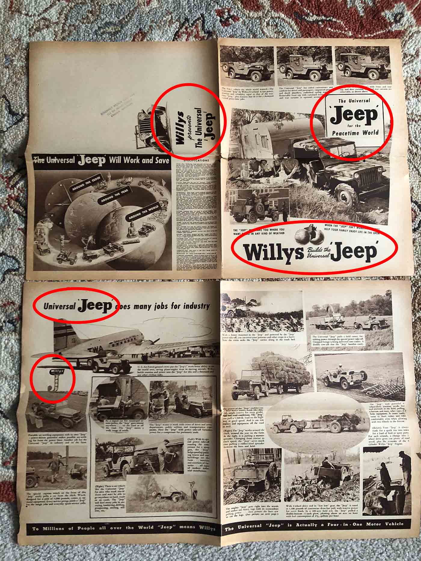
The circles in the images above and below this text highlight the implementation of the curly “J” along with the use of the new “Jeep” font AND the use of the “J” logo. Also highlighted is the “Willys Jeep” logo, a leftover from WWII magazine ads that uses the older “Jeep” font”.
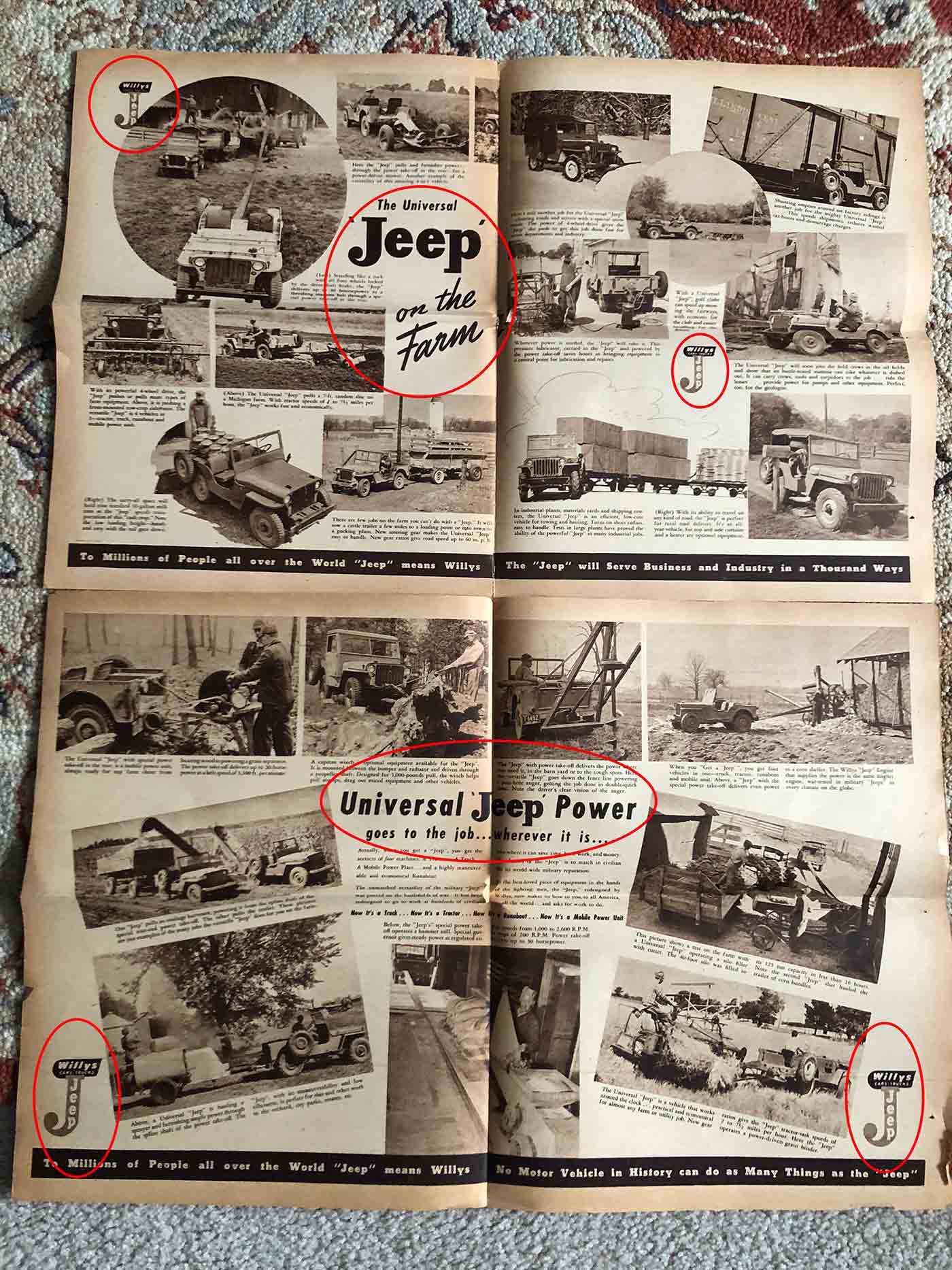
The reason we believe this newspaper was published earlier than the other ads is because the newspaper is a marketing mess of varying fonts for ‘Jeep’; the newspaper also included pre-war phases such as “Willys Builds the Mighty Jeep”; in addition, it shows varying jeep types (some experimental agri-jeeps, some CJ-2s, and some CJ-2As). As part of the effort to brand the logo, the “J” logo appears seven times in the magazine.
So, we feel that the “J” logo was first used around July or August of 1945. Then, after the Saturday Evening Post November issue, the “J” logo appeared in magazine ads, newspaper ads, and business cards.
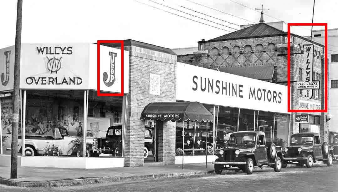
A similar (in intent), but not an exact “J” logo version also appeared on at least one dealer sign for Sunshine Motors in Florida. Below are night and day photos fo the logo. The “J” on the sign to the right has a curly portion that isn’t as tall as the one on the building to the left. Perhaps the one one the left was outsourced to a painter, while the one on the right under the sign was purchased from Willys for the purpose of hanging it under the sign? Those are answers we don’t know.
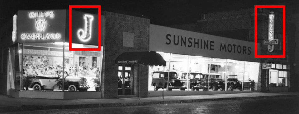
This photo was purportedly taken in 1948. It’s unclear when the bottom photo was taken. Given the same Jeepster appears to be in the window, it likely was taken around the same time.
Here’s another example. Here’s Willys Car and Trucks sign without the “J”.
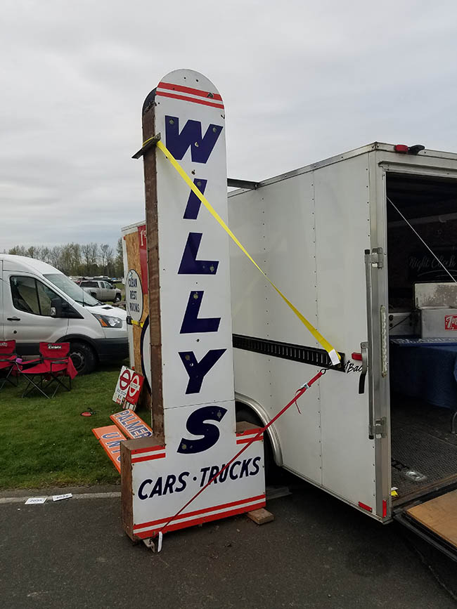
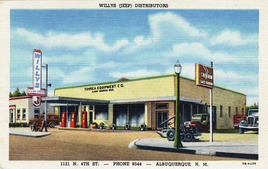
Now, this postcard shows the same sign design with the “J” added below it.
The “J” even ended up on envelopes (at least one of them):

We also found a red version of the logo on a September 1946 invoice:
![]()
![]()
When did Willys stop using the logo?
The latest example we could find of its use was on a January 19, 1946 magazine ad in the Saturday Evening post. After that, the logo met a quick end.

January 19, 1946 issue of the Saturday Evening Post.
What was behind the logo’s creation?
Once we had a time frame for the logo, we began wondering why it was developed in the first place and why it died such a quick death. We discovered that telling this part of the story required looking back at how Willys transformed during WWII from a car and truck company into a jeep company.
Near the end of the war, the jeep became not just a third category of vehicles, an important transformation in W-O’s business model, but also the flagship brand of the company. Yet, tthe company still had a traditional network of truck and car dealers, So, Willys had to respect those dealers and develop some type of advertising scheme that both introduced the jeep and embraced all three lines.
Thus, our theory is that the “J” logo was the result of that tension between the pre-war company and the post-war company.
In Part II of this topic (at least a week away) we’ll jump backwards to pre-war Willys-Overland, then see how the company shifted it’s marketing messages during the war years, both in terms of content and style, by following the Saturday Evening Post and Collier’s Magazine WWII and post-war ads.
Sorry, correction… the FOURTH patch. I missed the first one when responding, and can’t seem to be able to edit it.
Wow, great write up.. Looking forward the follow up. Quick question: Is there an all-encompassing book on the Willy’s-Overland history?
Great article! I appreciate the work completed on this research. Best read of the weekend for me!
I’ll do wutt I do best & add to yer confuzzedness. Fer wutt it’s werth; My ’50 pick’em-up truck has a brass Jeep tag riveted on it. The ‘J’ in Jeep is identical to those in the mag’s ad’s. I’m told that those brass tags were only around fer a year or two as well tho’!
right on bingo , my 1950 W-O 673 wagon has that little brass tag , the brass tag was one year only , 1950 , to be correct , it started in april 1950 with the new front end design , I have seen the tag on a few 1951’s , but only on the JEEPSTER , they were retitled 1950 models , noboby wanted them , except noted rock star neil young , his 51 heepster has one .
Awesome. It might be old news, but see posts 1461 and 1464 here: https://www.oldwillysforum.com/forum/index.php?threads/vintage-willys-pictures.2634/page-74 for more of the J.
Matt,
To your question … there are multiple histories of the jeep that span decades, but they aren’t generally too in-depth. One reason is that there is SO MUCH history that it’s hard to put it all in one book. A good example of this is WARBABY by William Spear. It’s a pretty dense (and I mean that in a good way) history (albeit with lots of photos) that just covers only the creation of the Bantam.
Another example, Fred Caldwell wrote an entire book on the pre-production CJ-2A.
All that said, I’ve been thinking about a deep-dive book (or a short 3-book series) about the history of the jeep from, say, 1940-1970, that includes not just the jeeps, but the associated culture and its affect on the jeep, the rise (and sort of fall) of the after market parts, the emergence of jeeps clubs, off roading, etc. It’s not all that different than how I’d approach a museum. But, I can’t do eWillys and write the book .. too much work.
Hey Dave.. thanks.
I have the Warbaby book (signed too!) as well as the Pre-Production 2A book by Mr. Caldwell and All-American Wonder vol 3, The Civilian Jeep Model 3A book by Bob Westerman, plus others.. and you’re (note correct spelling) right, there is TONS of info out there and trying to compile all that into 1 book or books: (be a Jeep Encyclopedia set so-to-speak) would be a massive undertaking.
Your book idea of a certain time frame and aspect or aspects of Jeeps or Jeep life (culture) would be something I think we’d all get a kick out of. Purists, rodders, mudders, crawlers, campers and enthusiasts; we all like “Jeeps”.
Great article. Thanks for all the research.
Aside: After a kind commenter on Hemmings.com pointed them out, I just noticed the two-tone wheels on the early CJ. Interesting.
Dan, I hadn’t noticed that either.
I have a six foot tall sign with this logo on it. It had neon on it at one time but it has broken off. I can send you a picture of it if you like (though I wish I had a better photo of it). I recently dug it up because I’m sending it off to Worldwide Auctioneers to be auctioned off in a couple of weeks. It’s in transit right now but they will likely photograph it when it arrives to them.
Hi Melanie,
Yes, I’d love to get a photo of this and any info on the auction. You can email me at d@deilers.com.
Thanks!
– David Eilers
Ewillys.com